
Acuvue Redesign
Global site redesign and digital rebrand for Acuvue.com.

The Project
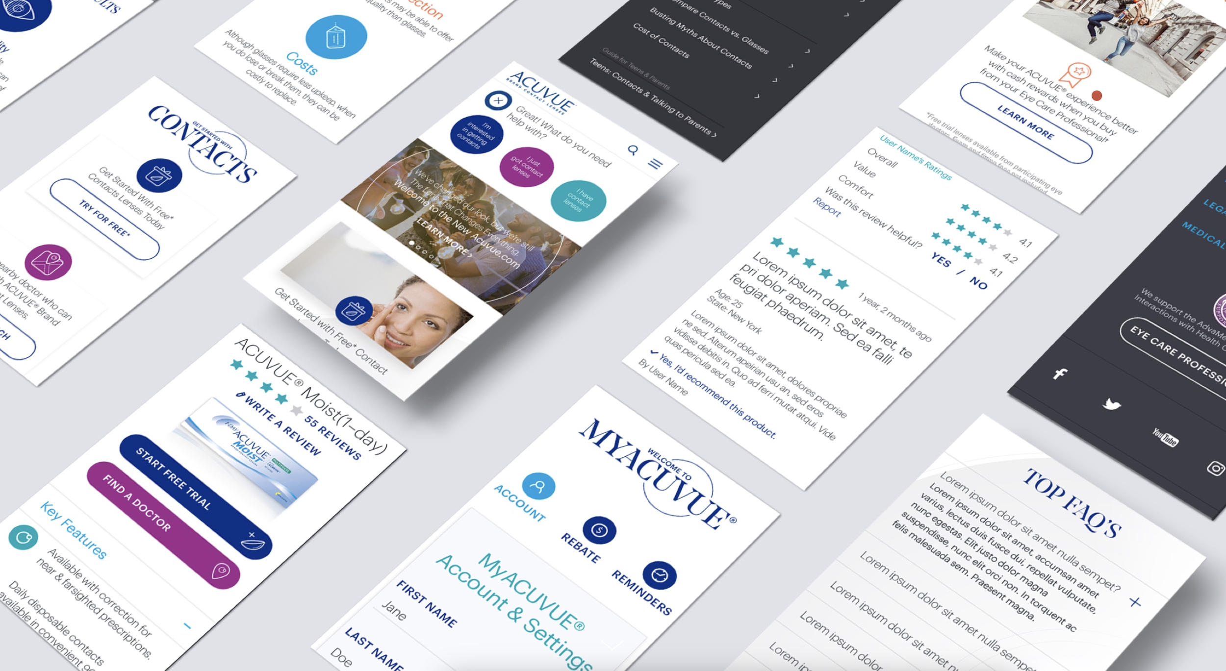
It had been over 10 years since Acuvue had updated their website design, and they needed a complete overhaul from the ground up. Not only did their content need editing and reorganising, they also wanted to represent themselves online in a less corporate, less old fashioned way and appeal to a younger market. We created a vibrant fresh new look(which is an important feature for a brand that deals with eyes), and launched the redesigned site first in the USA, followed by the other global markets.
The Challenge
There were three main challenges with this project:
An old CMS system handcuffed our ability to really push the design, so we had to work within the boundaries of what was possible.
Content on the site would be updated by local markets, so the new design needed to allow for flexible but cohesive design modules to ensure consistency between the sites in different countries.
Content: The site at the time was full of horrendously long paragraphs of text. Not only did these need to be cut down, the navigation as a whole needed a revisit.
The Strategy
The content audit and site mapping was a substantially long process for this global brand. The content and primary/secondary navigation was completely overhauled to help with the mammoth task of redistributing important content, and cutting down long paragraphs of text throughout the site.
While that was happening we began concepting different look and feels for the site, playing with type, colour and different site designs. Small simple ideas like incorporating illustration to help inform the user on the content to help with those long paragraphs also came into play.
My Role
Guiding our designers and illustrators, jumping on the tools and coming up with site design concepts, setting up presentations, overseeing our UX designer and bringing it all together:
UI Design Direction
UX Direction
Team Leader
Lead presenter to clients


This team was as big as this brand.
Alex Miller, Aaron Pederson, Priscilla Osredkar, Kamran Aslam, Mike Nicosia, Kirk Wallace, Sanghun Lee, Hyobee Kim, Rebecca Antonucci