
Hyundai
Optimising the Hyundai AU website for Australia’s third largest car manufacturer.
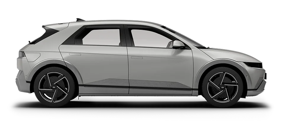
The Product
I had reservations about adding this work to my portfolio. The UX/UI remit for me and my team meant our work was designed beautifully, strategically and successfully pushed the needle on conversion with every launch. But the existing tech stack was pretty outdated, leaving the external dev team struggling to support my pixel perfect UI dreams. Regardless, the client(and dev!) relationship with Hyundai remained strong, and together we successfully delivered countless rewarding product features for both our users and the business.

1.5 Million
Monthly site visits

~900,000
Unique monthly site visits

31
Site feature updates in 2025
Models Page Redesign
The Background
The models page is the third most visited page for Hyundai.com.au and acts as a gateway to showcase Hyundai’s entire model line-up.
Based on GA analytics and heatmapping, Hyundai found the click through rates to the PDP or Car Price Calculator(CPC) were low. This was especially important for the CPC, as users coming here triggered the instance of a successful conversion. We wanted our users to land on models as a browser, and commit to the desired model on the CPC as a potential purchaser.
The Problem
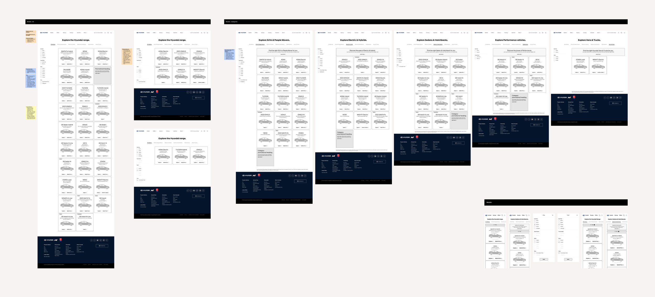
The cars themselves needed to be recategorised to better reflect the newer models hitting the market
Users were not able to filter the types of vehicle to reduce options on the default “All” display
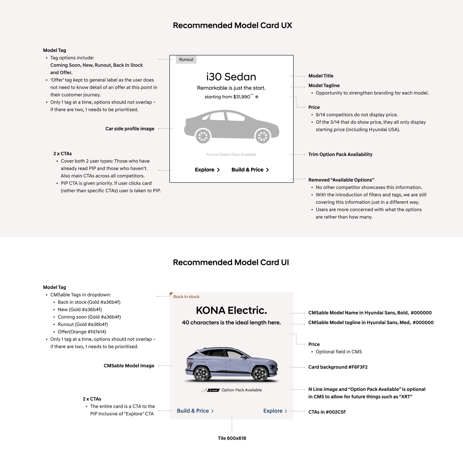
Hyundai needed a way to tag vehicles that were on sale, runout, new etc
Hyundai needed a method to display campaign and sale promotions that was currently unavailable in the design
Hyundai wanted to be able to control the order of the cars on display within the page
But for me, overall the design of entire page was outdated, and lacked the premium feel to match the cars themselves, particularly the newer EVs
The Solution
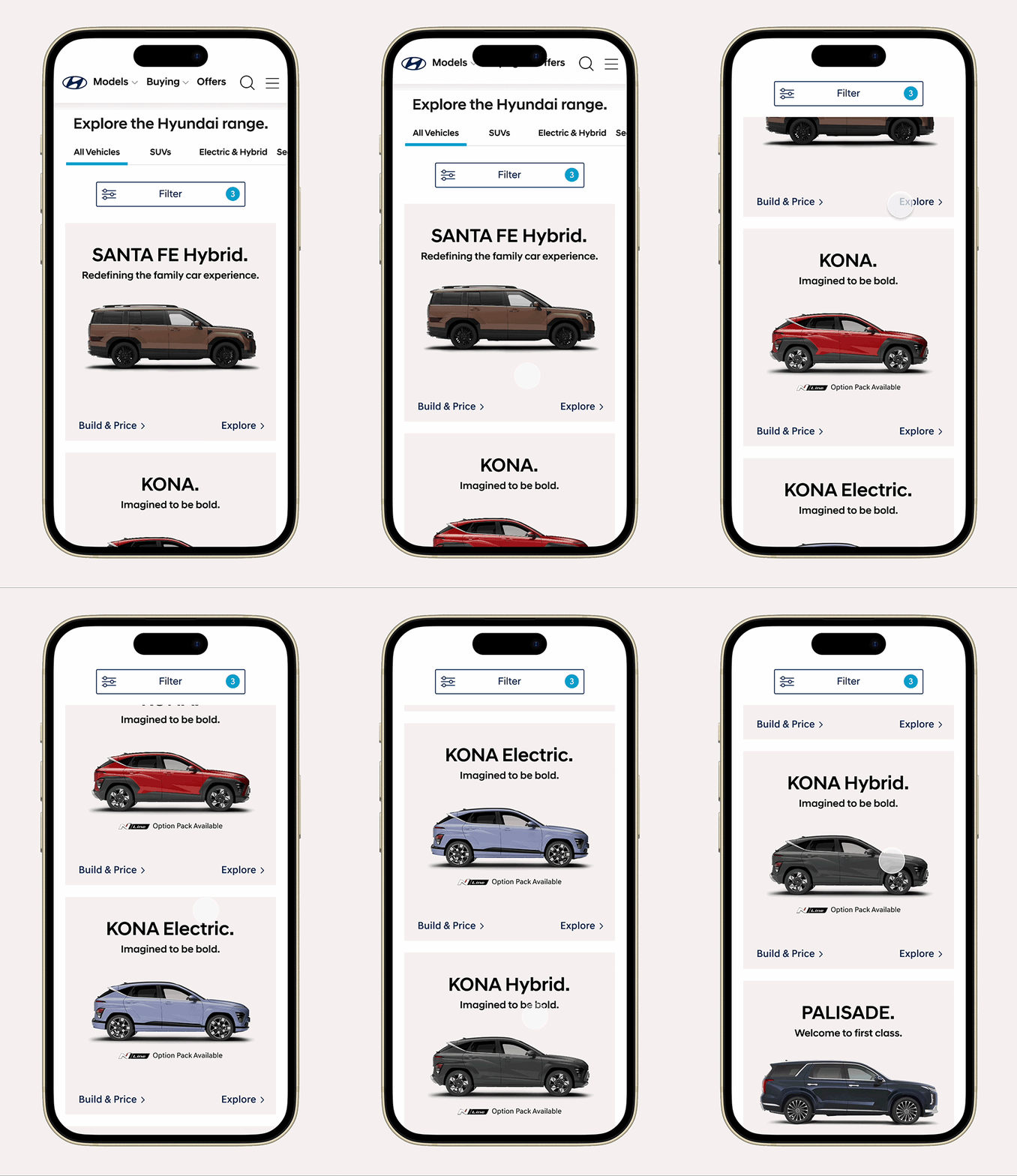
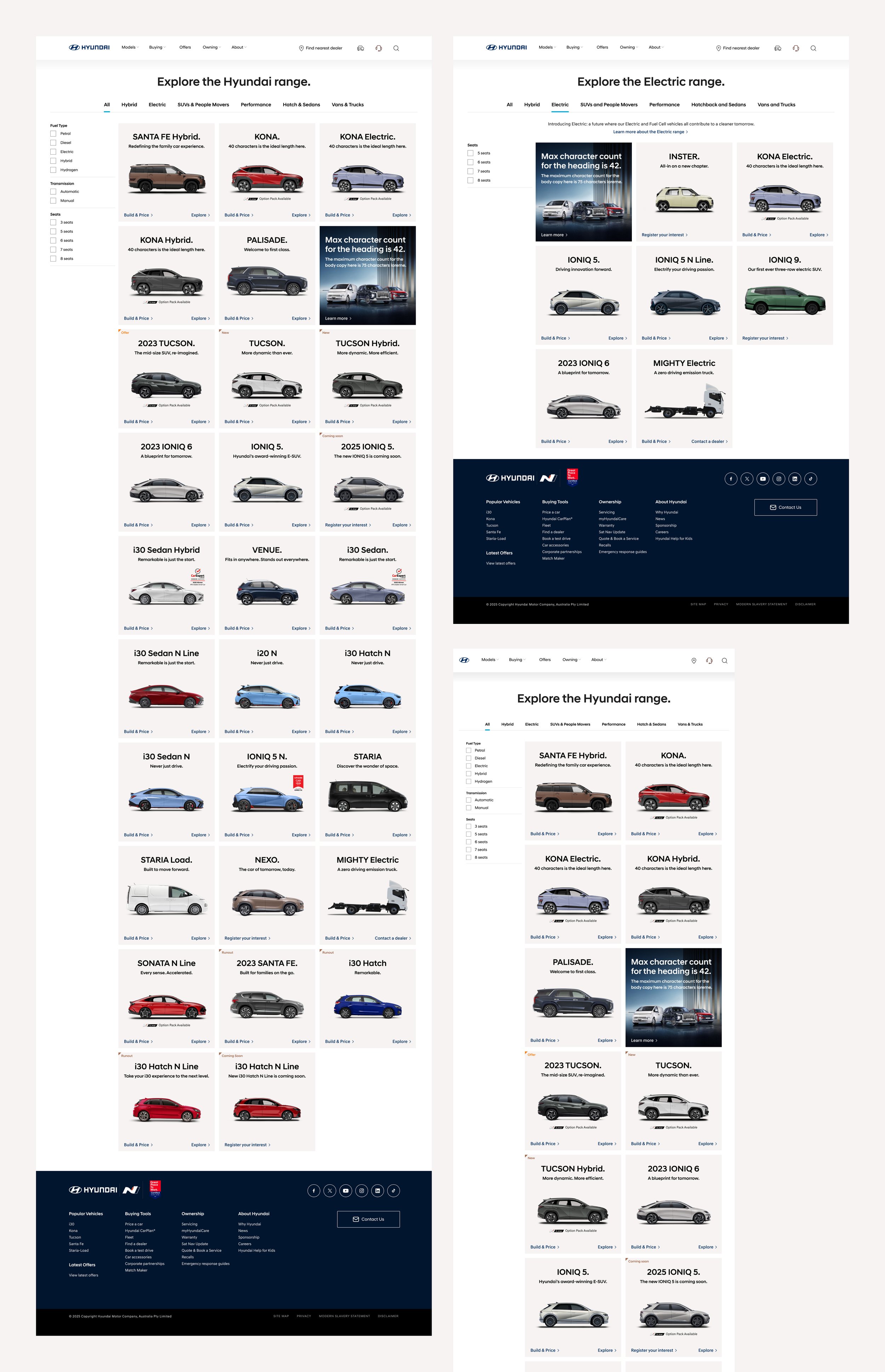
A much more open and orderly design that covered off all the points in “The Problem” section but in more detail, what I did was start with the basics – the complete redesign of the car tile itself. This model card needed to include a range of mandatory information with CMS-enabled options.
A colour tag indicator was introduced, with consistency in the design system whereby existing orange was always used for “offers”. A softer “sand” colour of the model card was added to tie in with the PDP hero of the same colour, and the overall page structure now had a reworked taxonomy, individual landing pages for categories to boost SEO, and a filter strap allowing users to filter their results and find their car more easily.
The Results
+9.2%
Increase in traffic for users from Models Page to PDP of a specific model, post redesign. This uplift is statistically significant, indicating a genuine behavioural change for users.
+3.5%
Increase in traffic for users from Models Page to CPC of a specific model, post redesign. This is a modest directional increase, indicating an improved model discovery for users.
Postcode Modal Redesign
The Problem
In order to display accurate pricing of Hyundai vehicles on the site, users needed to “select a dealer”. What users didn’t know is that there was an agreement with dealerships in that Hyundai had to display the dealership for the accurate price, not the postcode. So this one destination in the primary nav that needed to help users enter their postcode, change it, or Find a Dealer was all very confusing as what was feeling like a location-based entry was all linked to the dealership, further confusing the messaging and flow, and the rage clicks proved it.
The Ask
Solve the confusion and unintended action of users on the postcode modal based on the rage clicks observations and high cancellation/close selection by:
Improving the postcode modal UX to reduce confusion-driven clicks, including clarifying dealership changes
Improve the UI/UX for the "Find a Dealer" CTA
Consider further improvement suggestions to the flow and how the dealership is displayed on other parts of the user journey, from the PDP to the Car Price Calculator(CPC)
The Solution
The lightbulb moment here was that the current setup was a complete misalignment between what we were asking users to do, and what users actually needed to do.
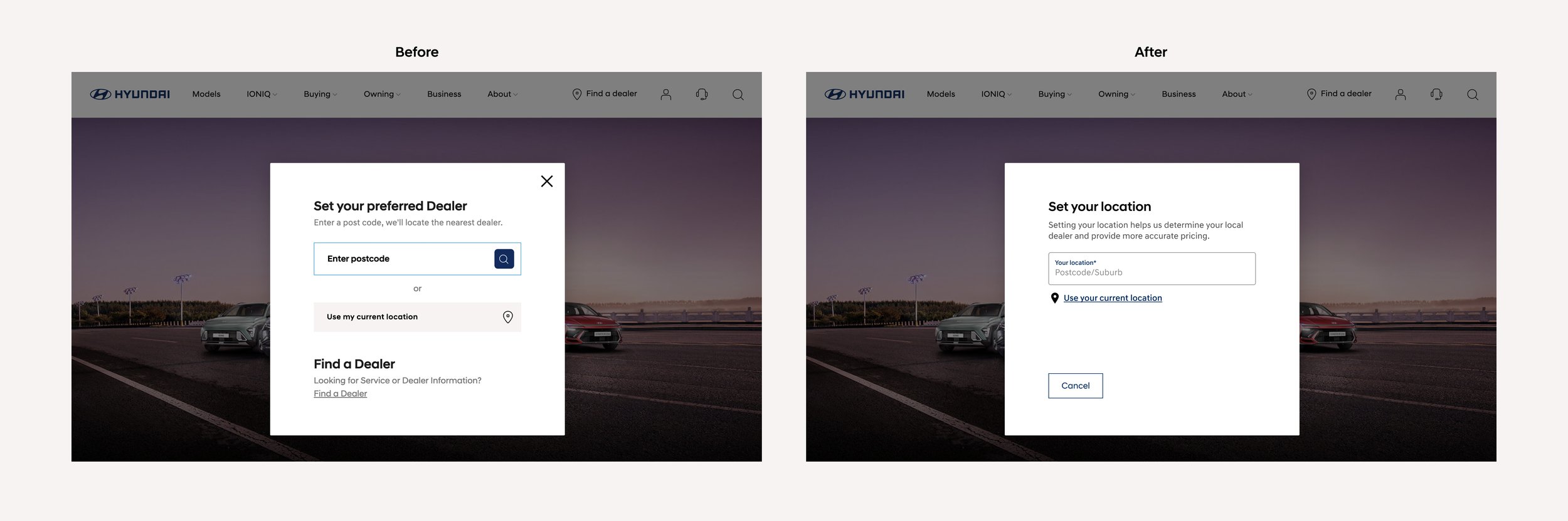
Since there was only one dealer assigned per postcode(again, which the user didn’t know about), users weren’t truly "selecting a dealer", they were “setting their location”, and the system would assign the dealer automatically.
Therefore, instead of asking users to “select your dealer”, we asked users to “set your location”.


The Results
Our solution of making the Set/Cancel step separate to the location input, and adding clarity to the CTA design and language brought great results. The extra tweaks of refreshing the language throughout the journey to be more user centric and action triggering ie. “Set/Change your location” vs. “set your preferred dealer” also reduced rage clicks:
Before
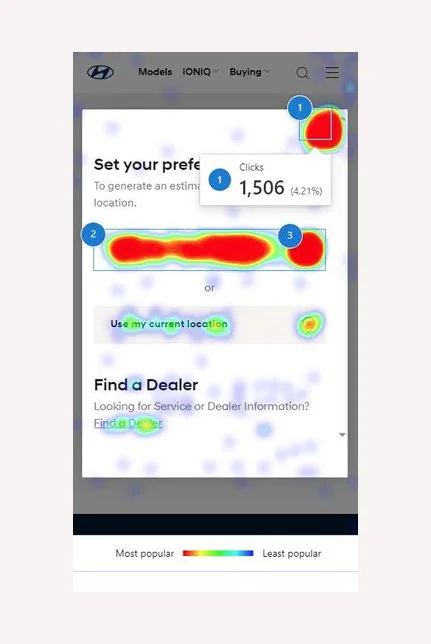
Two of top 3 clicks were for cancellation, showing this modal is generating the unintended action and confusion of the customers:
1. Modal cancel (17,153 Clicks)
2. Location input (12,832 Clicks)
3. Location cancel (11,046 Clicks)
After
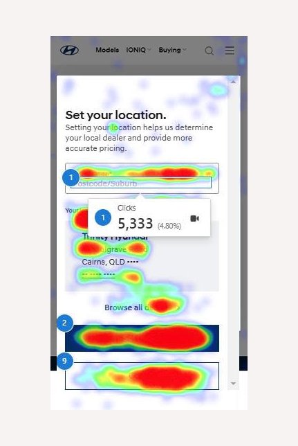
Top 3 user selections now matched the intended/ideal user flow with significantly less rage clicks:
1. Modal Cancel (897 Clicks)
2. Location input (5,332 Clicks)
3. Set dealer (1,754 Clicks)
4. Local dealer info (1,056 Clicks)
Homepage Car Carousel
The Background
The goal of this project was to overall improve the homepage experience for visitors from a UI perspective. Ideally it needed a complete redesign, as so much had changed since the initial page was designed 5 years before; New models had launched, competing brands had launched with newer, fresher sites, and the majority of their users, much like everyone else now viewed the site on mobile.
The Problem
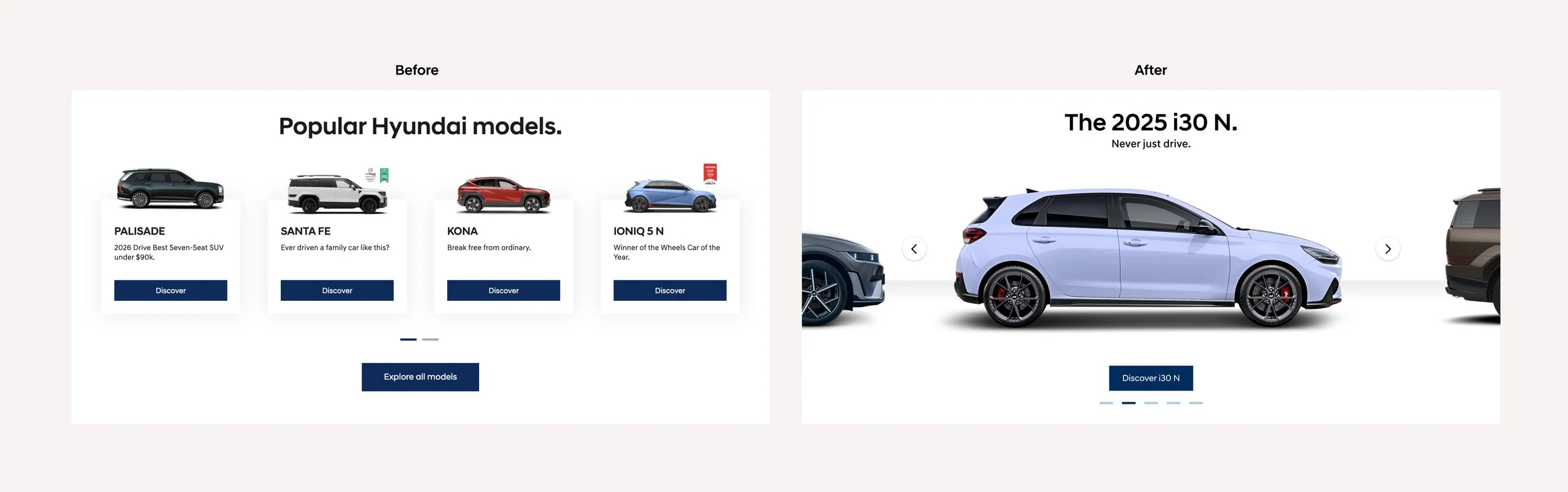
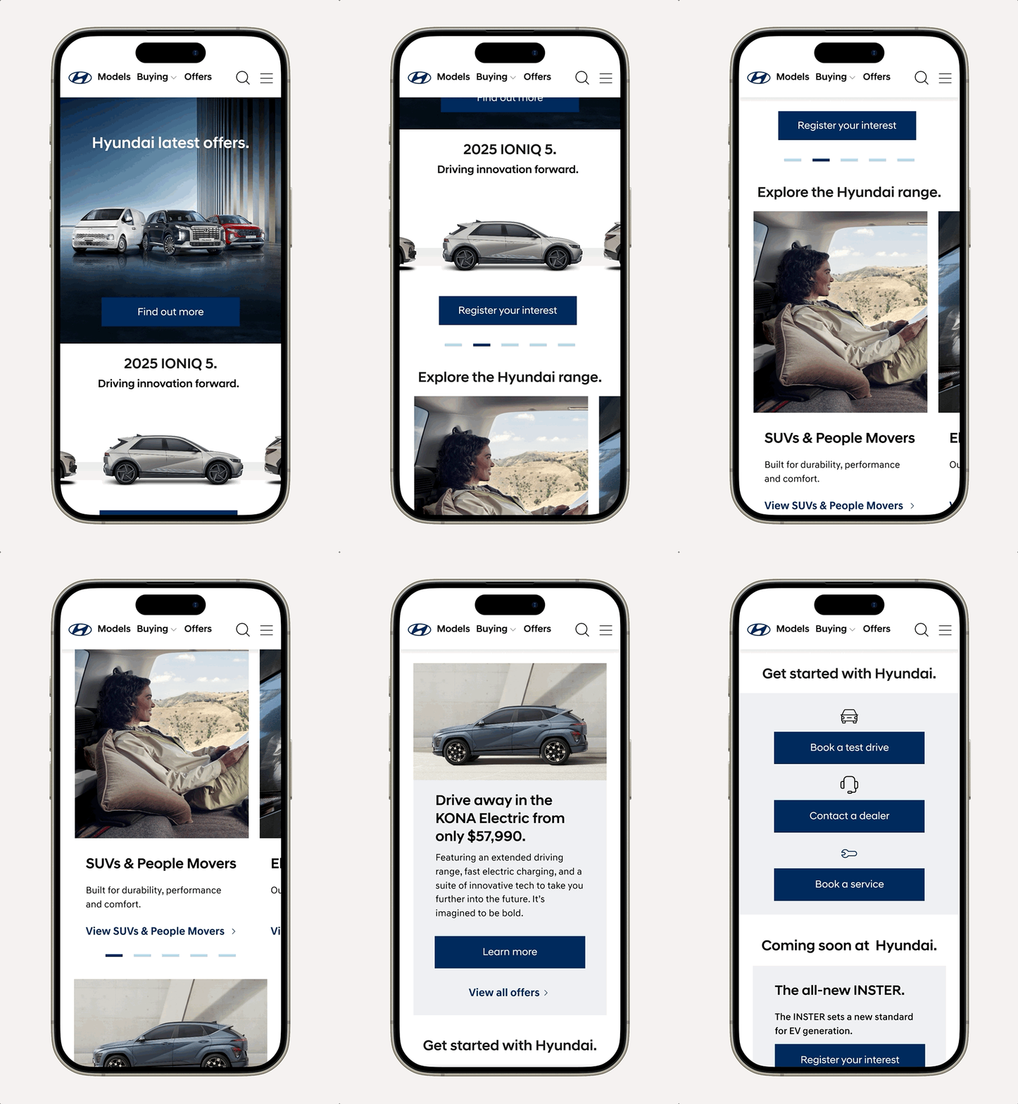
But a complete rebuild wasn’t in scope, so we opted for a suite of newly designed CMS components, including a new CMS-able car carousel component that would not only allow Hyundai to better showcase their models, but had built in flexibility to display optional price(that had to be fed in via a very complicated backend system based on user location and dealership), as well as offer and runout tags.
The Solution
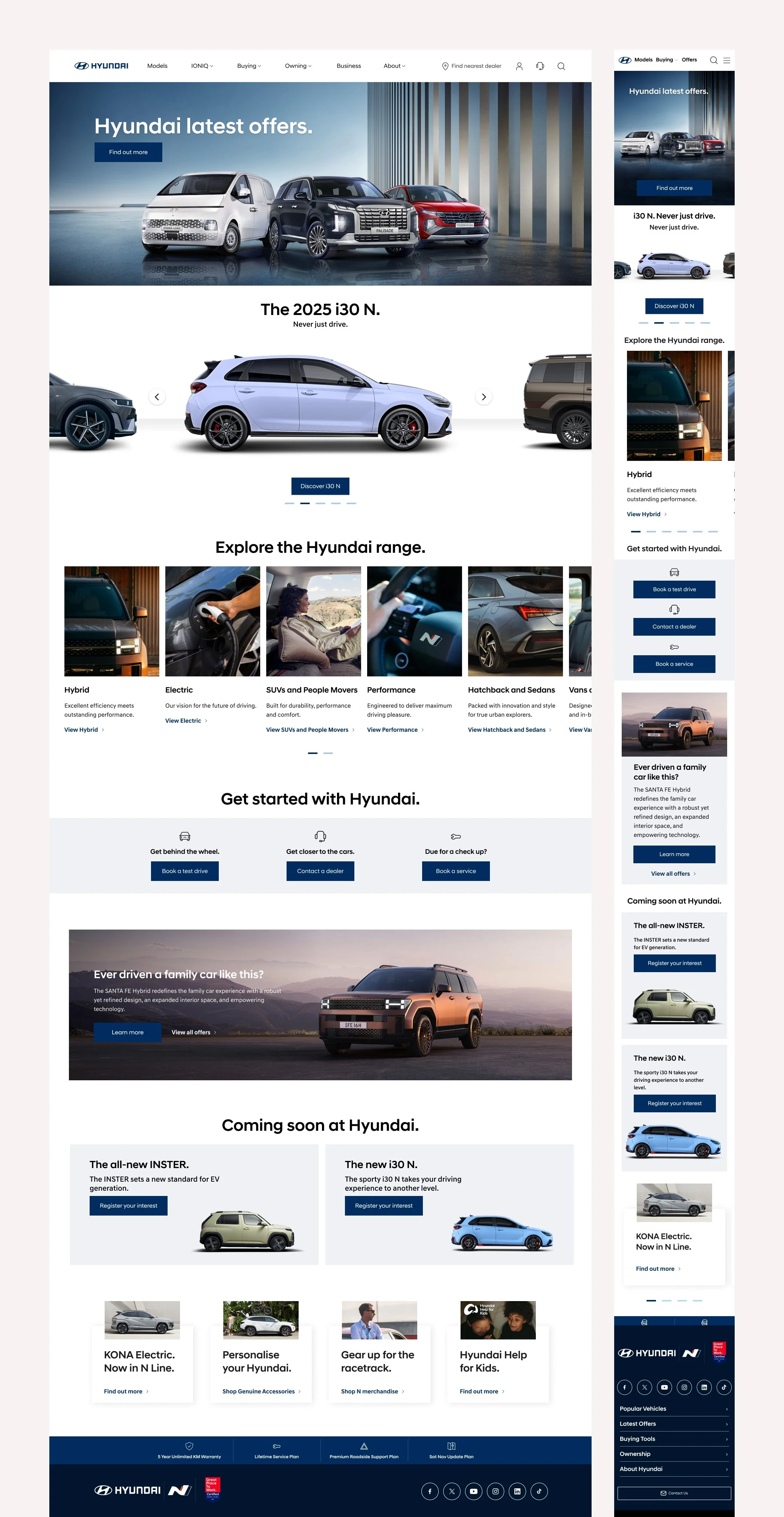
Designed a new Car Carousel Component that was CMS-able to include any model, name, tagline, price and tag
Designed a new Portrait Rail Component to allow for a better mobile experience for model categories on mobile
Designed a new CTA Banner Component to represent the 3 main KPI’s we wanted users to take
Designed a new Promo Banner Component specifically around model offers that featured large imagery that responded well on mobile

The Results
+26,722
Increase in Car Price Calculator(CPC) starts annually
+18,290
Increase in Car Price Calculator(CPC) completes annually
thelab dreamteam are as follows:
Rebecca Hammett, Michelle Chow, Sally Fang