
Google Primer
A free education app on how to better your business told through short, interactive lessons.

The Product
Google Primer was a free mobile app with fun, 5-minute, jargon-free, interactive lessons that could help anyone start their own business, and learn the basics of digital marketing. I worked on the UX, UI and marketing collateral. Our small team meant I wore many hats. Long before "human-centred design" became industry shorthand, we obsessed over our user’s needs to learn, for a global user base all over the world. I worked on countless releases, brainstorms for high level ideas, rapid prototyping, before designing high fidelity options for testing, then solidifying final polished UI designs and briefing dev with the essential VQA round to ensure pixel perfection.
Google Primer at it’s peak:
30+ million downloads over its 8 years (2015 - 2023)
3 million global monthly active users
One of Google’s highest rated app
(Appstore 4.9 / Playstore 4.6)
International reach with support for
13 languages
The next few sections outline a snapshot of the many releases we pushed over Primer’s lifetime.
Segmenting our users to serve them what they want.
The Insight
The Primer Marketing Team ran Google Primer, and in 2019 a presentation was given on the user segmentation they had created based on their research of local markets. Based on their findings, our users could be divided into two main personas: Job Seekers/Workers and Small Business Owners. Further to that, they would then be divided into people who were starting, and people who wanted to continue in those categories.
The Problem
Our current version of Primer did not allow for any segmentation in the onboarding process. It was merely a three step carousel of what Primer could do. Segmenting our users from the beginning would allow us to serve our users content that was more applicable to their situation. The more customised the lessons, the more our users would learn, the closer they were to achieving their goals.
The Solution


Personalization, one step further.
The Insight
As Google Primer became older and wiser, the little beta app that once was got absorbed into the philanthropic education wing of Google: Grow with Google. GwG believe that communities thrive when people have the skills they need to succeed, so it made sense to have Google Primer become a part of that seeing as it is a business and marketing app that provides lessons to help people grow their digital skills, career, or business. This meant Primer’s North Star had shifted– rather than focussing solely on First Lesson Completes, we were now focussing on user impact, guided by the same principles of Grow with Google, and that is to take lessons and help people achieve their goals.
The Analysis
We identified the areas within Primer that we could improve to drive better user impact – on Home for example. The DCTA(Direct CTA) that we introduced the year before was represented by the illustration from that lesson, and a simple CTA that said “Start” or “Continue”. The purpose at the time was to drive users to complete the lesson that they started, which was successful in the north star of FLC, however it was proving to fail when it came to guiding the user. What lesson were they in if they didn’t know the name? How much further did they have to go? So many questions were asked.
The Solution
After getting stuck into the research and countless brainstorms, discussions and meetings, we landed on three key feature ideas that we felt would be incredibly useful for our users:
Update DCTA design to include lesson names
introduce Goals
introduce a Playlist
Wireframes - Updated DCTA

Wireframes - Goals

Wireframes - Playlist

Release Summary


Lesson bonus content, found.
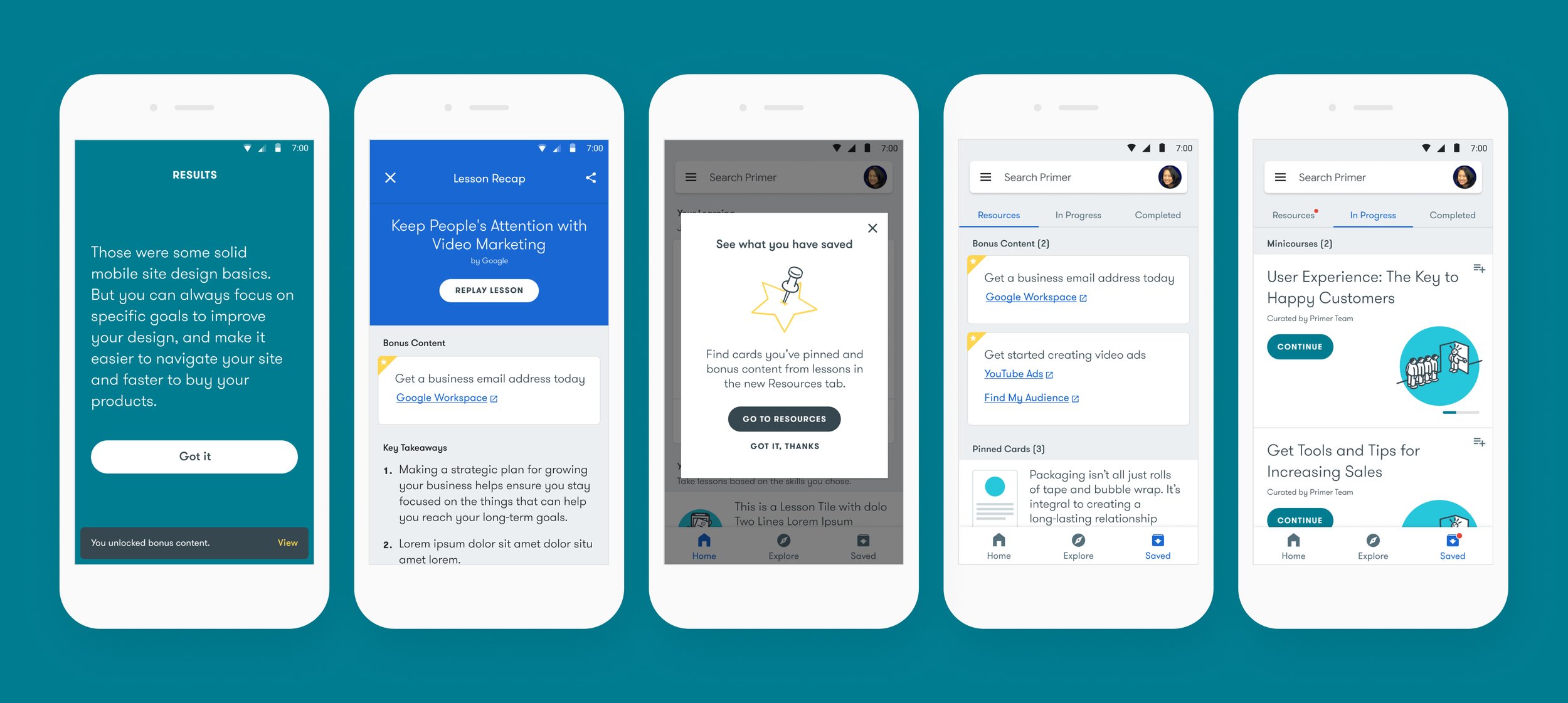
The Problem

Each lesson within Primer came with a Summary, or a “Lesson Recap” for users to refer back on what they’ve learned. About a third of these Lesson Recaps contain “Bonus Content”, an extra titbit of information aimed to tap into the more gamified-driven user, whereby the more lessons they complete, the more they unlock. Bonus Content contains links to helpful sites pertaining to that lesson, and the Content Team really wanted these to become more prominent, as they benefit users who wanted to take action in the real world after completing the lessons. I identified some problem areas with the current setup:
the only way to access Bonus Content currently was via the Lesson Recap – which meant you had to remember the name of the lesson in order to see it
there was no way of knowing that you unlocked Bonus Content, unless you visited your Lesson Recap. If a user completed a lesson, and chose to start another lesson immediately, they would miss it. If a user was completing a minicourse(a group of any lessons), they’d also miss it
The existing snackbar that popped up to inform the user that they’d completed the lesson, was a missed opportunity to convey more information on Bonus Content
The Key Areas
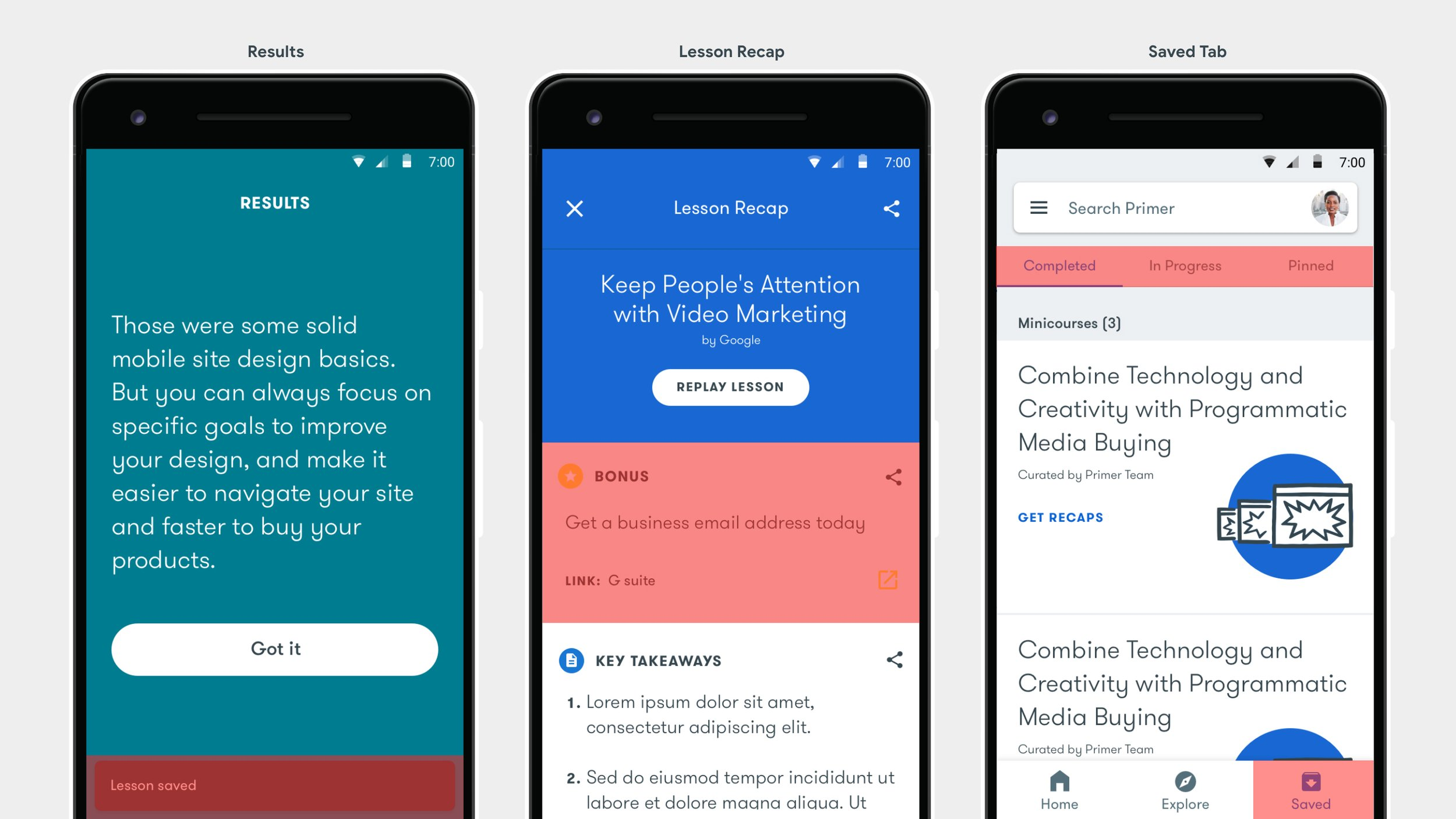
So after assessing the current various user journeys and how they would find their Bonus Content, the screens we were going to address, including the sections within them were:
Results - address the design of the Snackbar
Lesson Recap - address the design of the Bonus Content area
Saved Tab - this section of Primer currently housed Completed Lessons, In Progress Lessons and Pinned cards, but it seemed like a good place to also include Bonus Links
The Idea

As we were having ideas on updating the Saved Tab to include Bonus Content, I did a visual explore as I felt very strongly that if we wanted to surface Bonus Content throughout Primer, then it should be visually consistent, no matter where it appeared. This would aid in user understanding of what Bonus Content is, and also streamlined the way this same information would be displayed in other parts of the app: Enter, the Bonus Content Module. There was much trial and error with how it was designed, I landed on this. This simple module could then appear in various parts of Primer, particularly the Lesson Recap screen and the Saved Tab.
Final Designs
Bringing Primer to your browser.
The Insight
Now that Google Primer was formally a part of Grow with Google, there was an opportunity to incorporate Primer’s valuable lesson content into the GwG website. The marketing team would promote Primer content in various forms which would drive everyone to the GwG website – but we would need a solve for how Primer would manifest in browser.
The Problem
The very obvious problem was that Primer was an app, not a website. The lessons were designed for the phone, not for your browser. We also had to make sure our visual solve would work for a responsive site, so users could complete Primer lessons on their phone, but in browser. After much deliberation on a name, we decided to call the project: Primer for Websites.
The Solution
The content team helped categorize Primer lessons into beginner, intermediate and advanced levels, so we could drop our Primer lessons into an already established system on the GwG site. We then began our UI designs by using some key Primer app screens – Minicourse screens, Lesson screens and Lesson Complete screens as our wireframes, but ensuring we incorporated UI elements around the content for a browser experience.
How users would find Primer content on Grow with Google:

UI elements we introduced to bring Primer to browser:
We needed a way for the user to go back to the Minicourse Landing page to view/take other lessons so we introduced a drawer nav
We incorporated app download bugs on the Minicourse Complete screen to encourage user’s to download Primer
We needed to incorporate Google Sans(this was pre the big redesign) so a small design adjustment was needed to make it more on brand and integrated into Grow with Google’s look & feel.
Final Designs


We were like a tiny start up in the middle of the big G. Wow, what a crew:
Alex Miller, Lee Felarca, Jeff Cranford, Natacha Fernandez, Gina Binetti, Justin Cegnar, Kayla Wellbery, Gwendal Le Bec, Gabi Manga, Jenny Nelson, Kim Mok