
Sleeptracker-AI
Tempur-Pedic sleep solution app redesign and new features update.

The Project
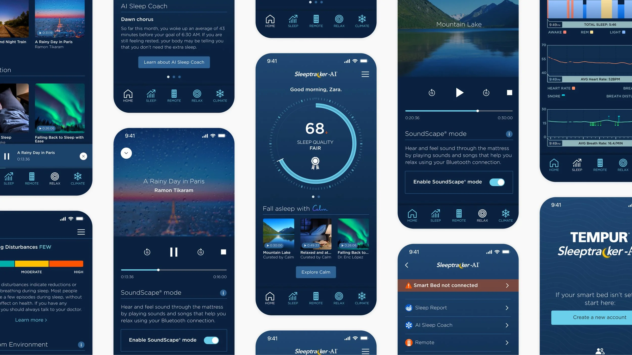
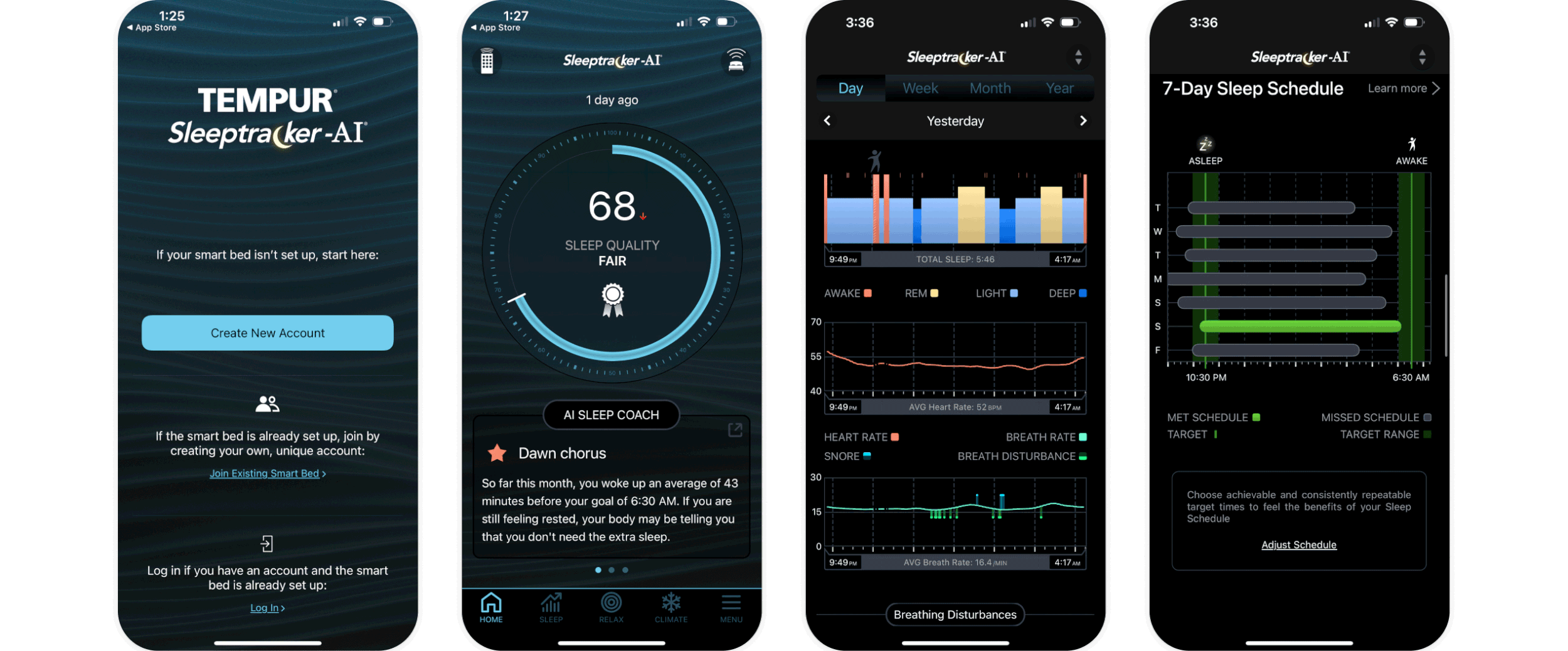
Tempur-Pedic have an app called Sleeptracker-AI that pairs with their range of “Smart-Base” mattress bases that gives people next level data stats on your sleep.
Tempur needed to update the UI of the app to incorporate their missing branding, and also introduce a new sleep-audio section within the app, a collab with the calming audio files from the Calm app. Chart UI was(unfortunately) not allowed to be touched.
The Challenge
The existing structure of the app that was crammed with huge amounts of information wasn’t changeable. That meant the typography of the design system needed a robust hierarchy structure to allow all heading, CTAs, body copy, chart data and disclaimers all to live harmoniously within the one screen view.
My Role
My involvement was primarily UI with best-practice UX improvements. The initial build was a dev-first project, meaning the app came with no design system – so I built one. I also had many other roles including:
Design Direction
Team Management
UX/UI Design
Stakeholder + Client Presentations


Who doesn’t love a before and after?
Always give credit where credit’s due
Sally Fang, Jenn Seide, Sheri Hyman