Google Prime logo featuring a stylized rocket with blue, green, and grey colors and three white lines representing motion.
Laptop screen displaying a webpage for a business lesson app, with the title "Small Business Budgeting: Track, Plan, Prepare" and an illustration of a person with glasses reading a book. The webpage has navigation links at the top, and app download buttons for Google Play and the App Store. Illustrations of animated books and a person in business casual attire crawling or pulling at the books are at the bottom.
Comparison of two mobile app screens for educational lessons, with annotations labeling fonts and features, showing lesson details and navigation options.
Three smartphone screens displaying different stages of a user interface for a business app, with illustrations of people planting and taking care of plants.
Sample text showing the Google Sans font with the name 'GT Walsheim' and the full alphabet in uppercase and lowercase.
Comparison of font styles GT Walsheim and Google Sans, showing uppercase and lowercase letters G and A with descriptive text about their differences.
A collage of mobile app screens displaying educational and business content related to digital marketing, customer engagement, accessibility, and workplace inclusion, with some screens showing lesson progress, quizzes, and resource links.
Sequence of cartoon characters transitioning from playing and lying on the ground to talking at a table with a woman.
A sequence of screenshots of a mobile app interface, showing features related to tracking customer behavior, answering questions, voice controls, budgeting, engaging with social media, providing results, and lesson recaps.
Screenshots of a mobile app onboarding process with four steps. The first shows options to specify why the user is here, like starting or improving a business. The second has the same options with a highlight on 'Start My Own Business'. The third displays selected skills with checkboxes, including Business Planning and Money Management. The fourth shows an illustration of diverse people caring for plants, with a button to continue or a 'Got it' message.
Screenshots of a digital lesson platform showing completed lessons, lesson recaps, and links for further resources, with titles such as 'GREAT JOB' and 'Lesson Recap.'

Rebranding Google Primer

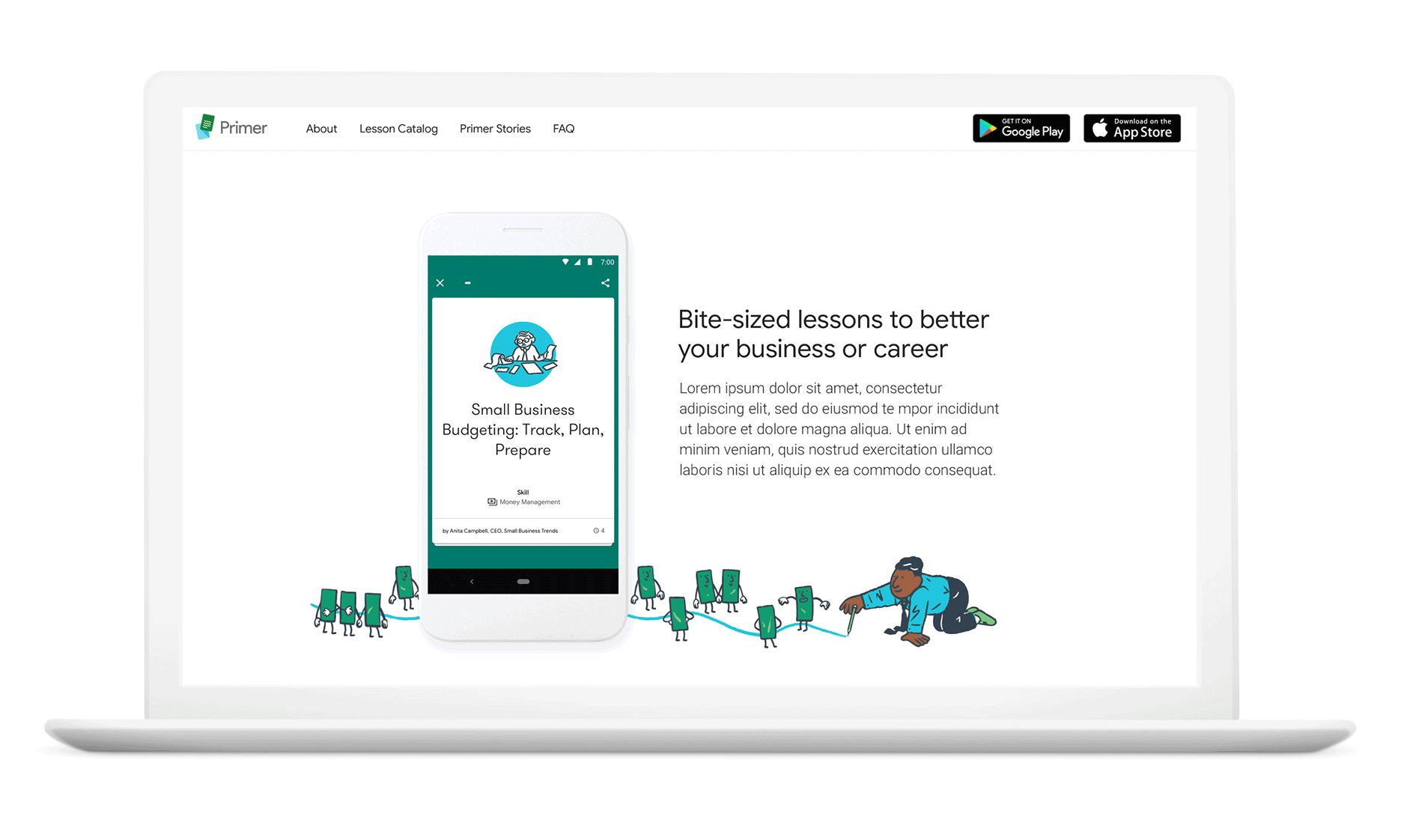
When the Google Primer App was integrated into the Grow with Google ecosystem, it stood out. The illustration style was different and non-inclusive, the colour palette wasn’t on brand, Google Sans the proprietary font was nowhere to be seen, and the logo – well, it didn’t look like it could sit alongside the over 700 other product logos within Google. In Primer’s beta years, the brief was for it to not look like a Google product. But the app evolved into something bigger, and Google wanted to make it official.

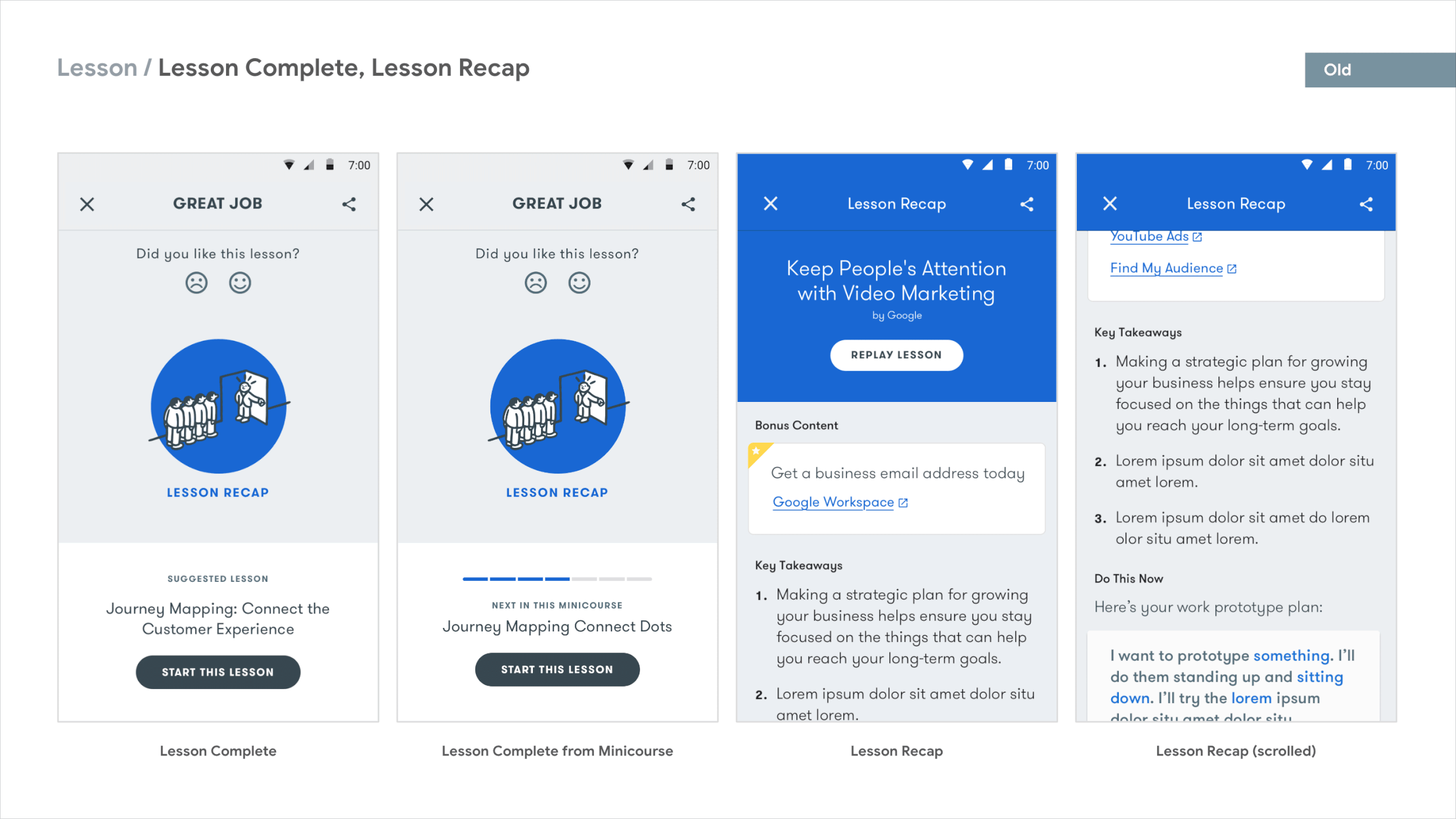
Who doesn’t love a before and after?

Screenshot of a webpage promoting Google Primer with sections about lessons for small business skills, app download options, user reviews, and app interface images in blue and green tones.

Re-Rebrand Video

FUN FACT: This was the second time we rebranded Google Primer. Prior to this rebrand, we took on an “accessibility redesign” to make Primer WACC compliant, along with refreshing Primer’s brand to incorporate stronger paper themes and lesson categorisation working with the incomparable paper artist Owen Gildersleeve. Here’s the summary of how we got here.